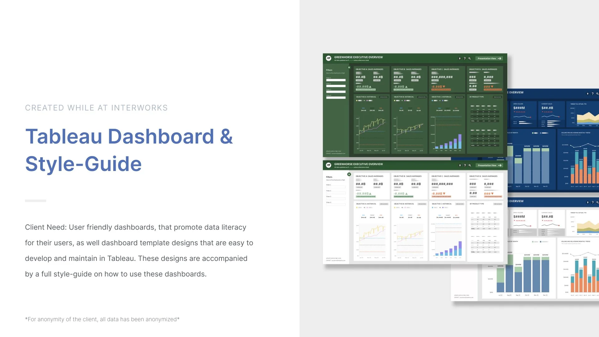
Who are GreenHorse and BlueMule?
Before we jump into this project, I’d like to take a second to discuss the client and who they are. GreenHorse and BlueMule are pseudonyms being used in this project to protect the anonymity of the real client this work was made for. All branding, names and data have been anonymized to insure privacy. GreenHorse is National Banking service that is the father company of a smaller brand called BlueMule, who specializes in mortgages and other home and family services.

Dashboard Templates
Below you’ll get a quick walkthrough of my dashboard process from lo-fi to hi-fi iterations, my process, the final templates, and how these templates are presented in the style-guide.
Taking the feedback from the second round of iterations, the client liked V1 and V2 the most.
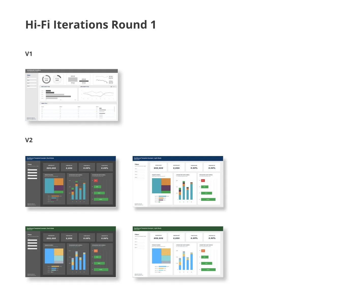
From there, I built on these versions for the first round of hi-fi iterations.
V1 of the hi-fi iterations was me playing with what this template could look like with some generic visualizations. At this point I didn’t use any color so that wouldn’t distract me from focusing on the foundation of the board.
V2 is a slightly re-worked version of V1, Since there are two brands we are working with, at this point I felt that I was ready to add color into the templates so that I could see how the branding and visuals would work as well as testing a light an dark version.
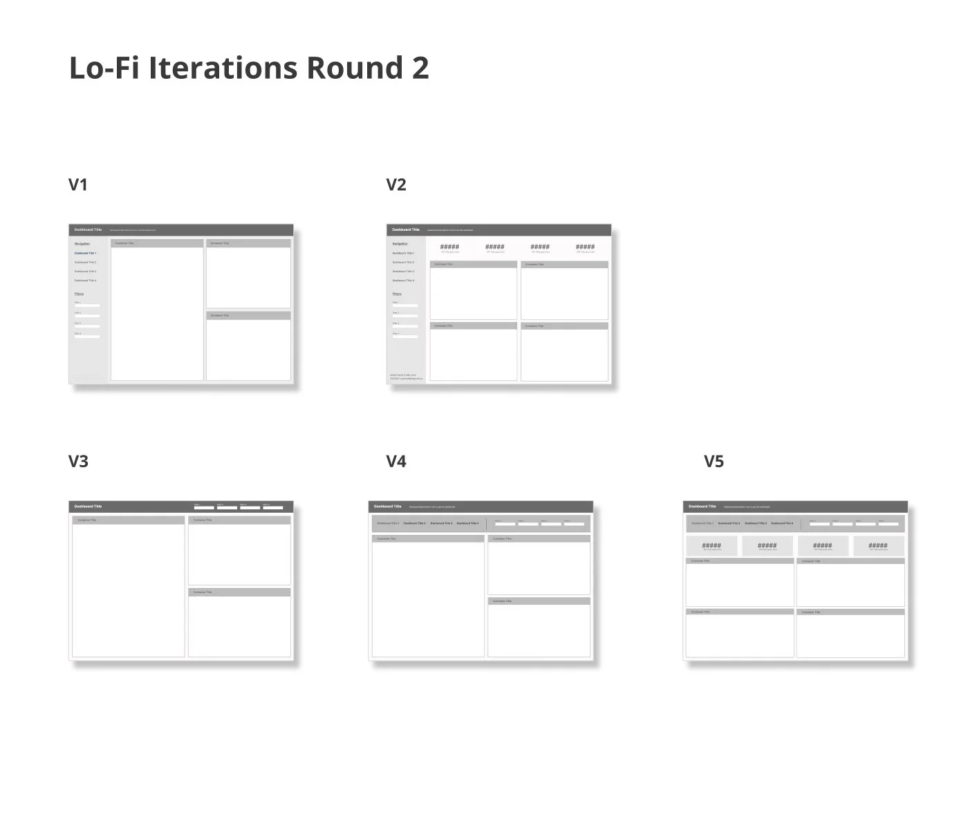
Round two of lo-fi iterations was made using the previous iterations but adding more details in terms of filters, navigation, and titles to create a more hi-fi visual so the client can picture how the dashboards would be used in the users daily work flow.
These iterations would be the first the be shown to the client, I feel it important to keep things very simple for the first showing so that we can both confirm we are on the same page, and there isn’t any wasted time or effort into a layout that isn’t meeting the clients needs.
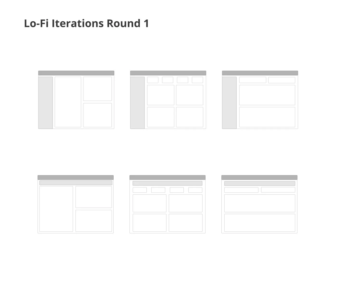
The initial round of lo-fi iterations were made in FigJam. I always feel that the best way to start a project is to keep things very base level, where I can just focus on the foundation of the dashboard.
The client made clear that filters were very important to them and their user flow, so the main goal was to show different layouts for an executive overview, while making sure that the filters are very prominent and easy to find for the user.
The filter areas are in the light grey.
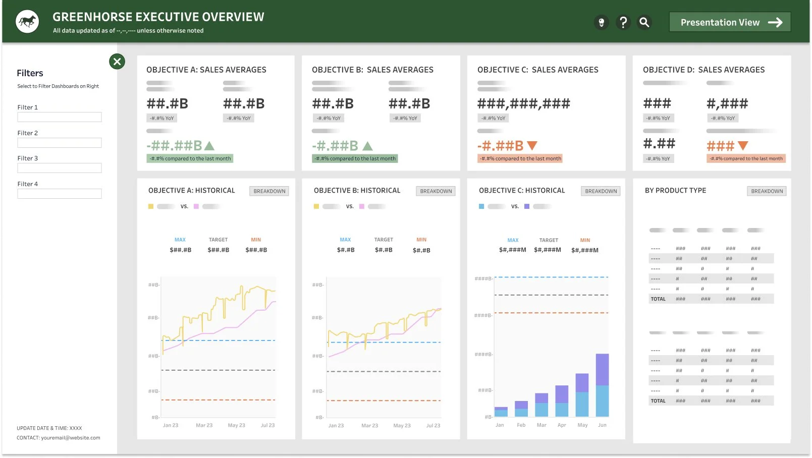
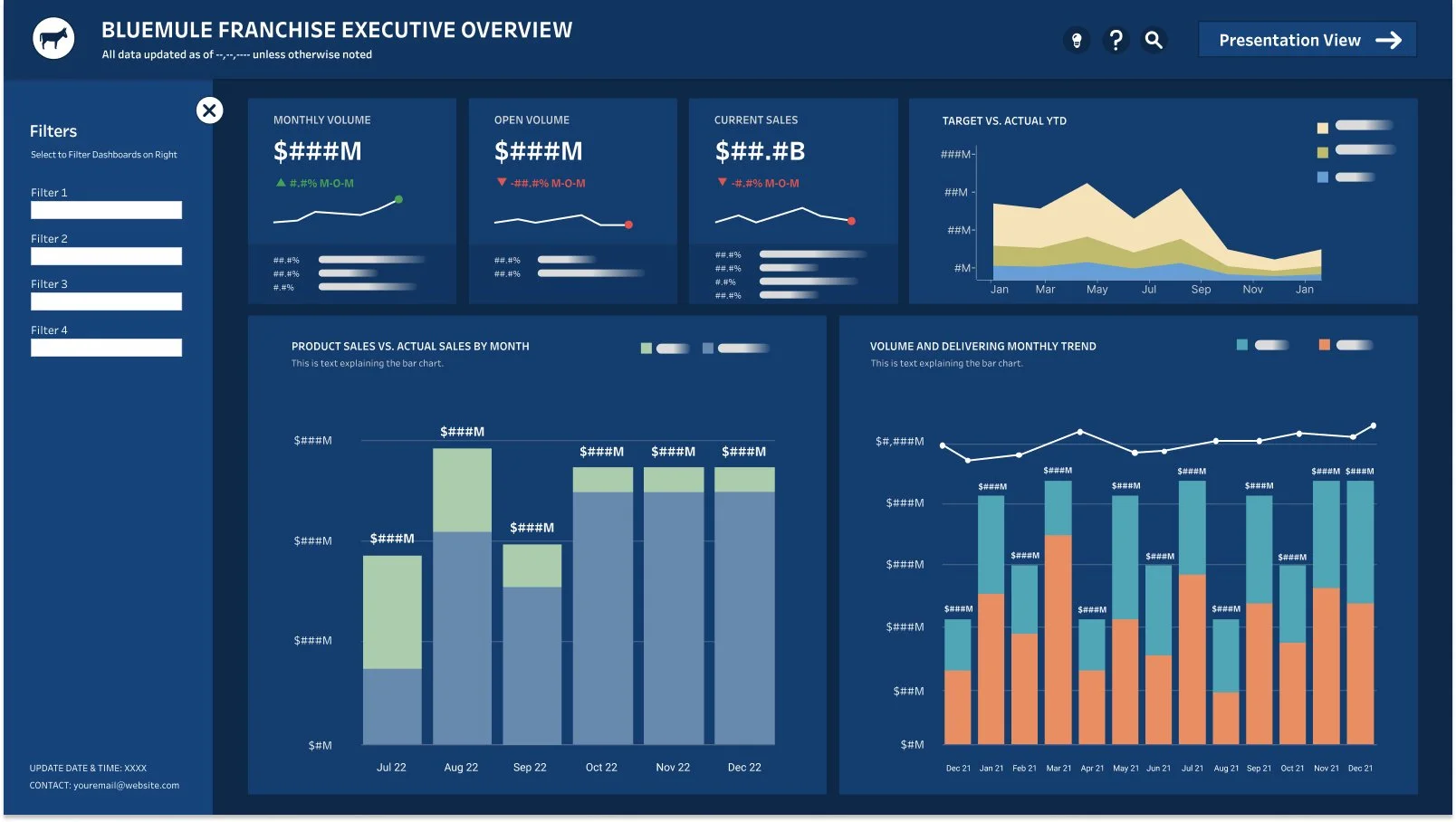
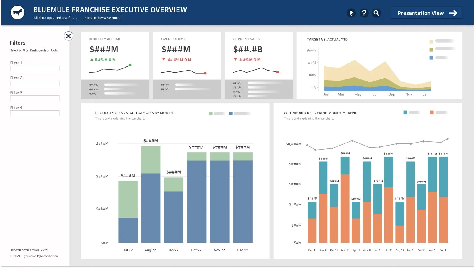
Final Version of GreenHorse and BlueMule Dashboard templates
After the first round of Hi-Fi iterations, I spent a number of hours iterating on the visualizations, colors, navigation, etc.
After going back and forth with the client multiple times, we agreed on these four templates.
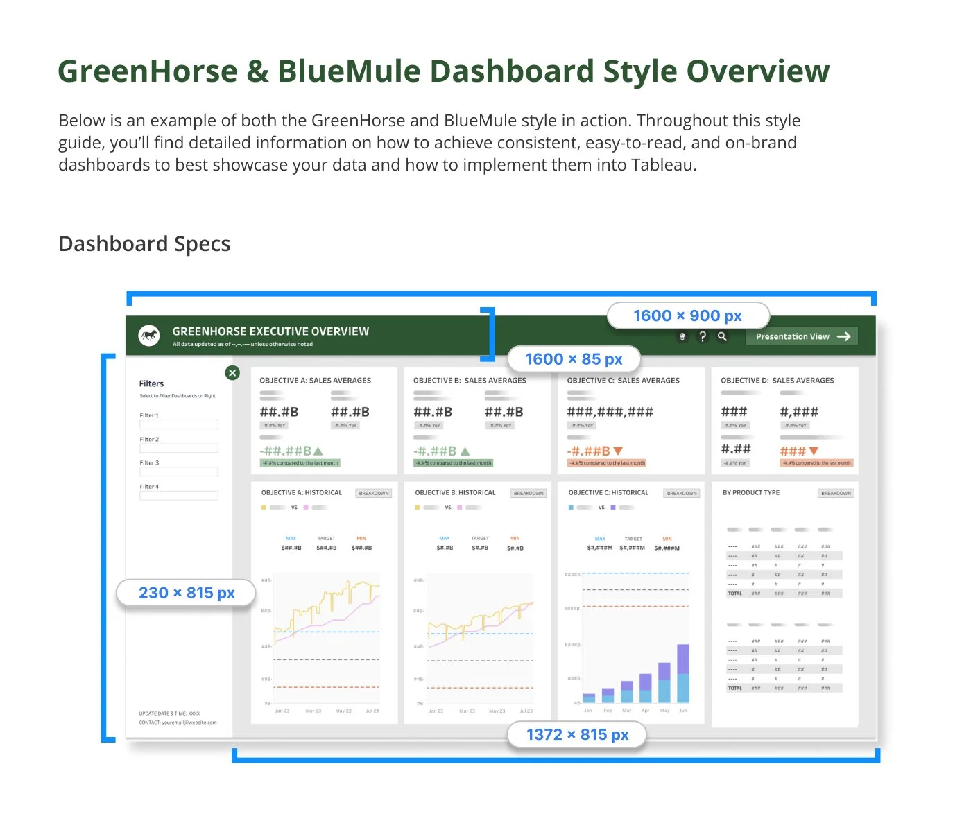
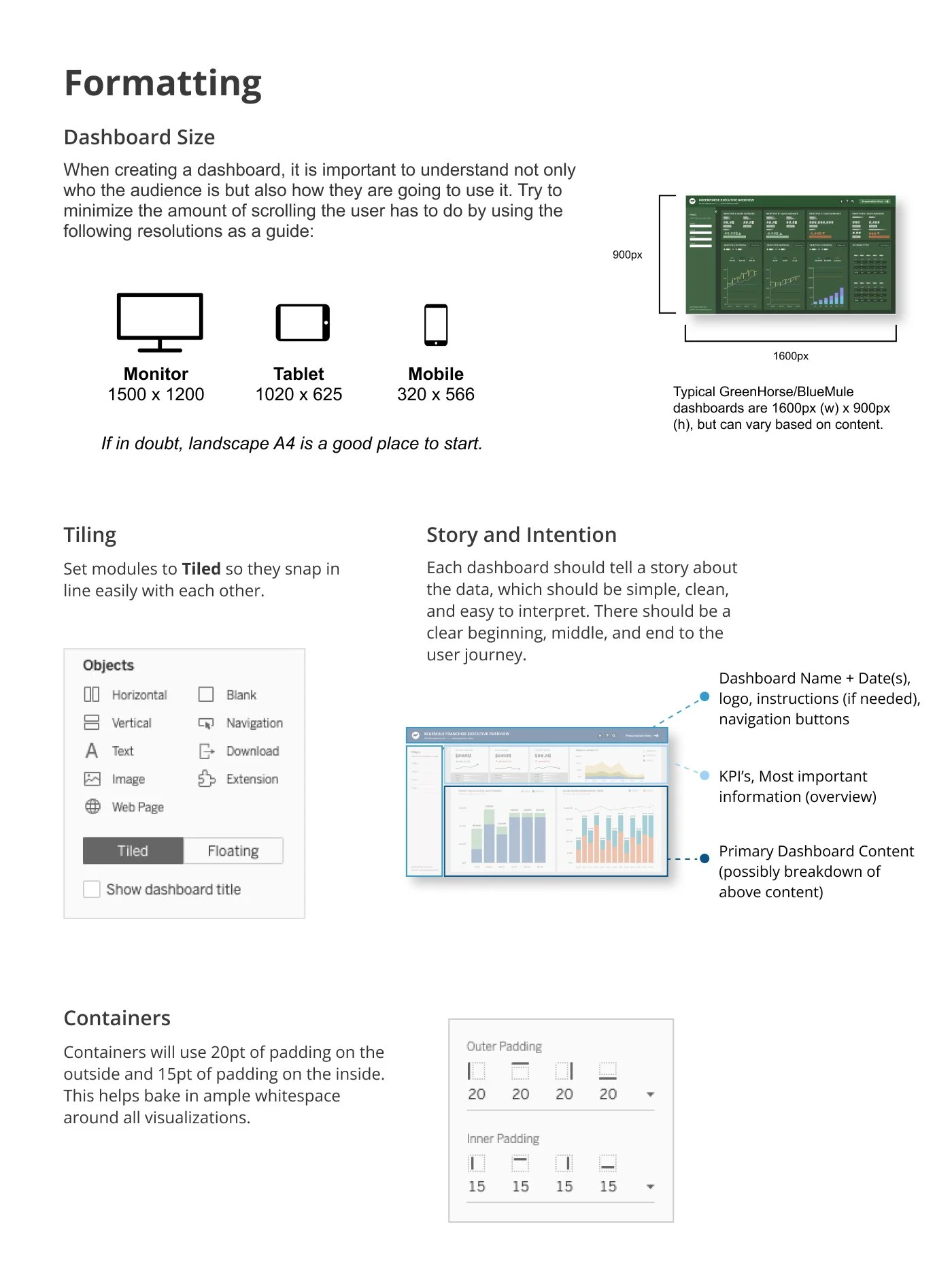
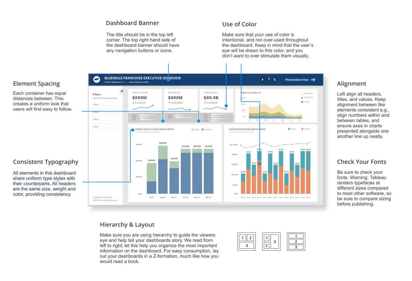
The above image gives the user a clear overview of the four new dashboard templates, highlighting the specs of the dashboard pieces.
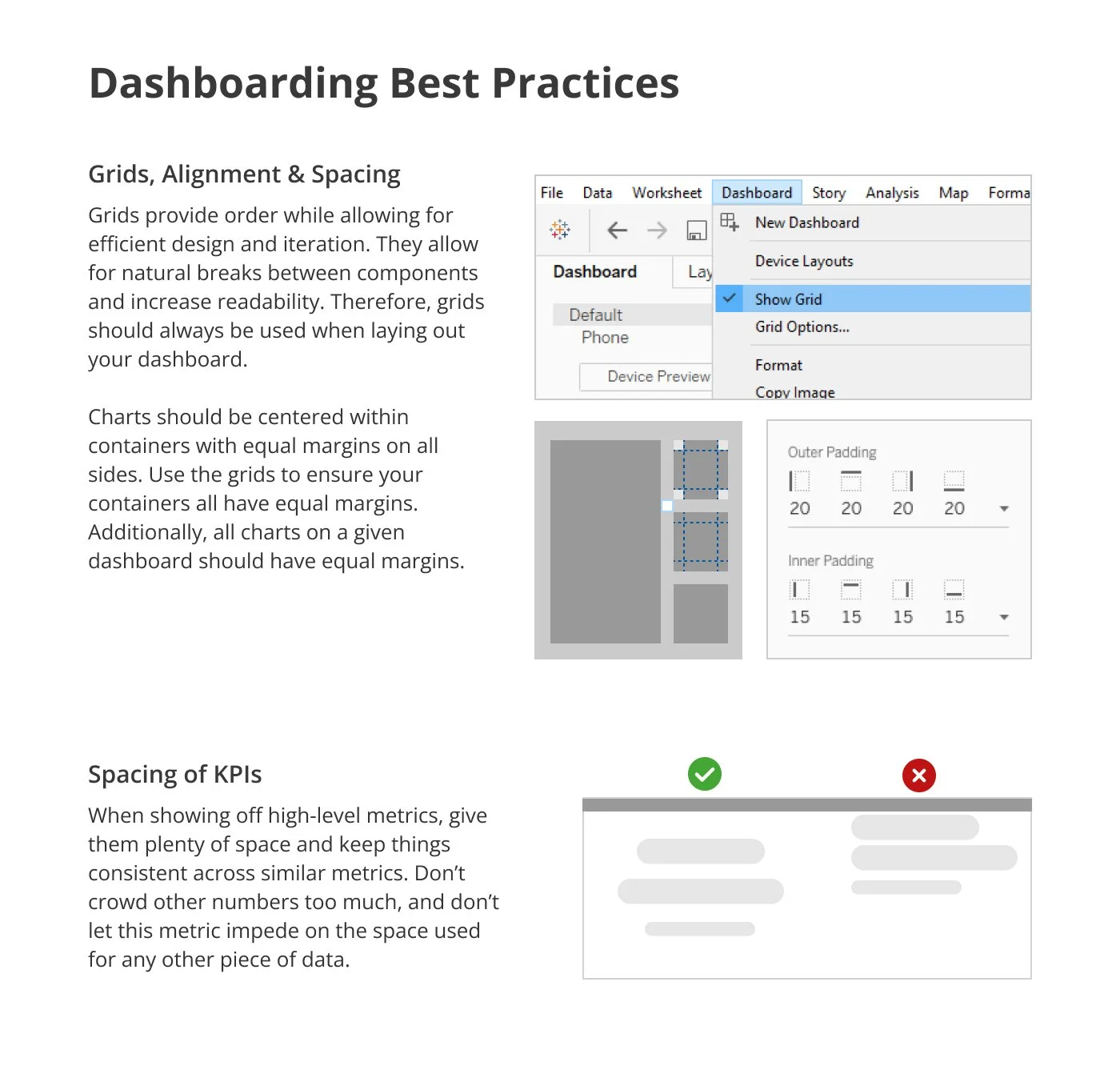
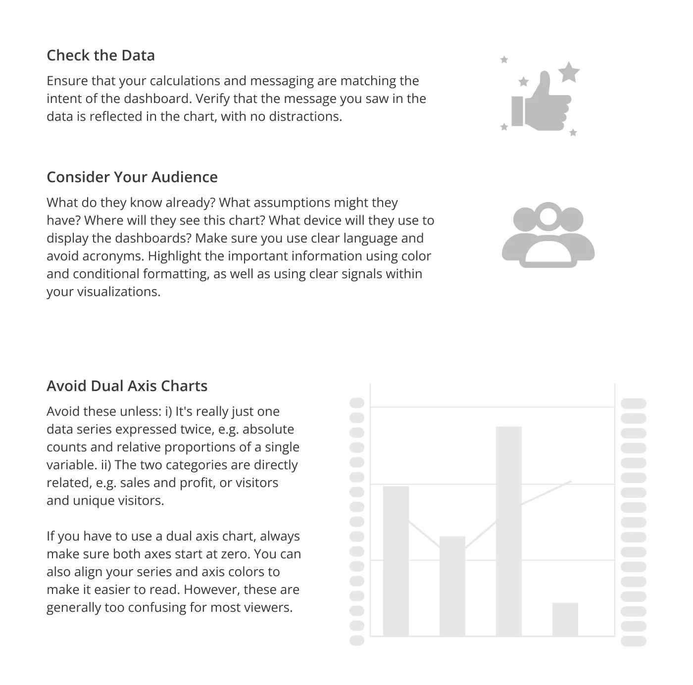
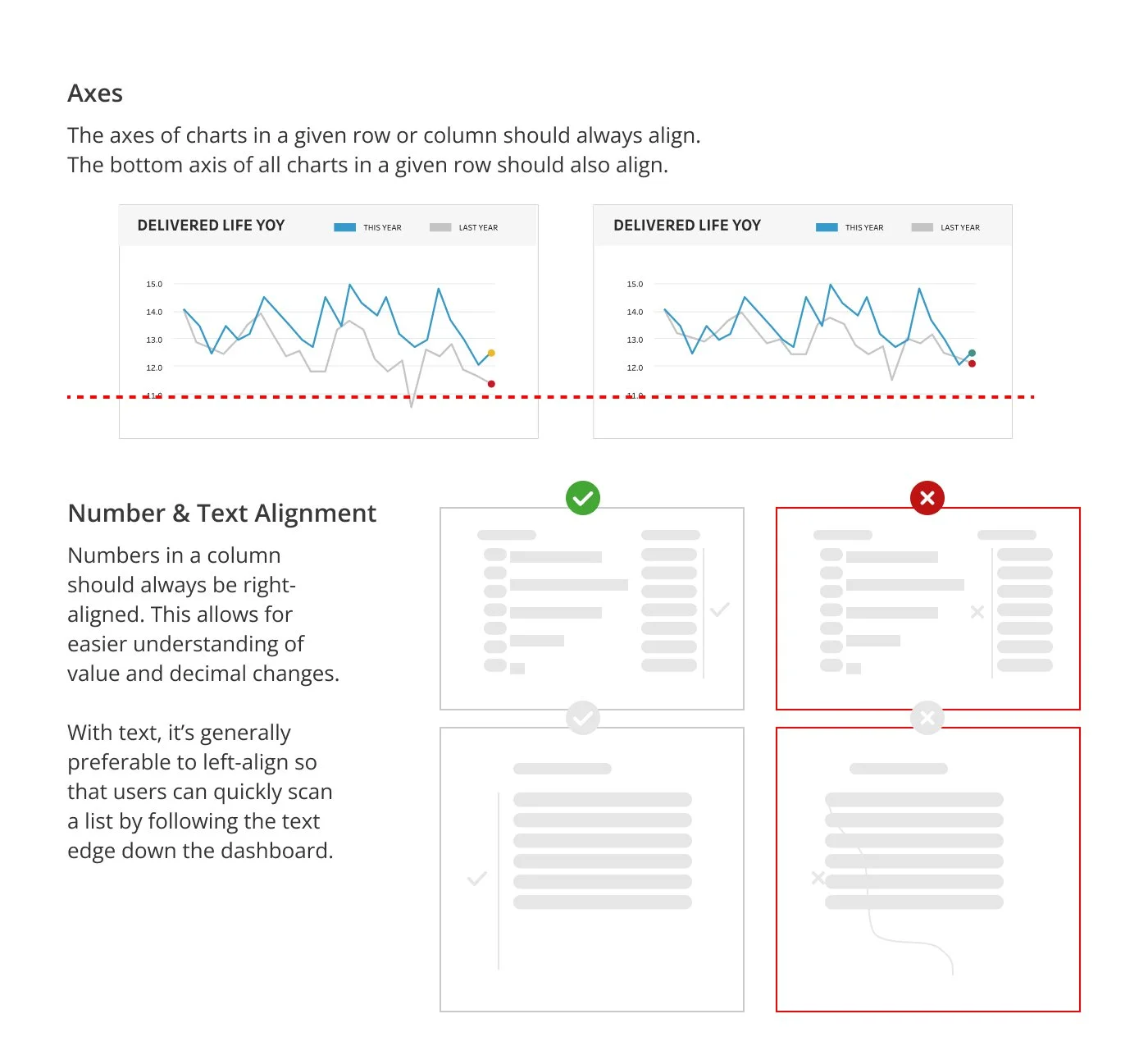
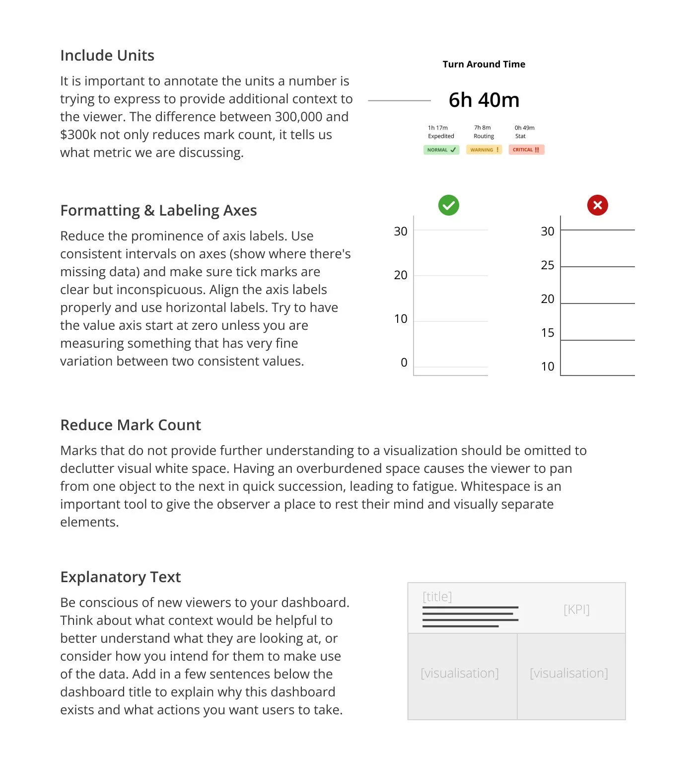
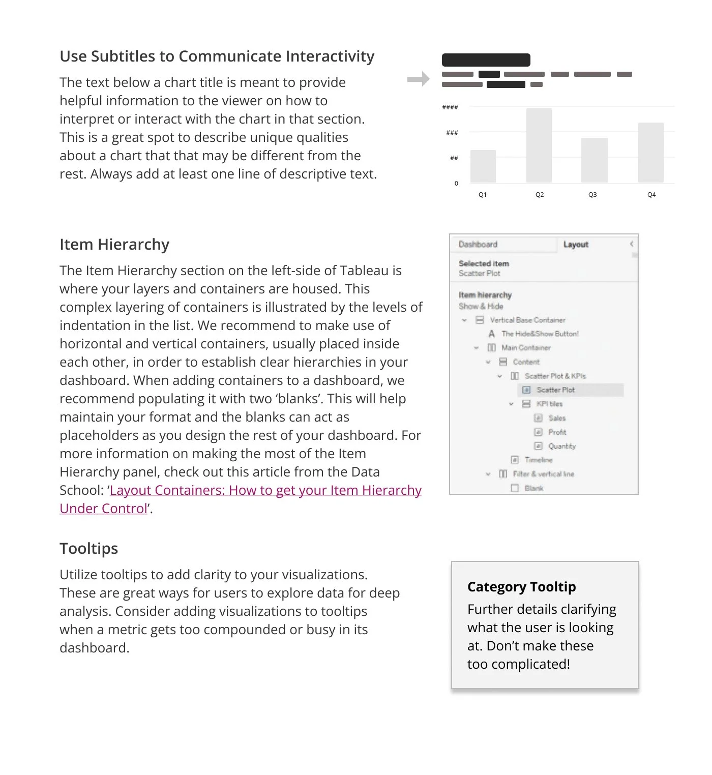
The first image below breaks down best practices of a successful dashboard, showing examples and explanations on basic design principles to keep in mind while developing.
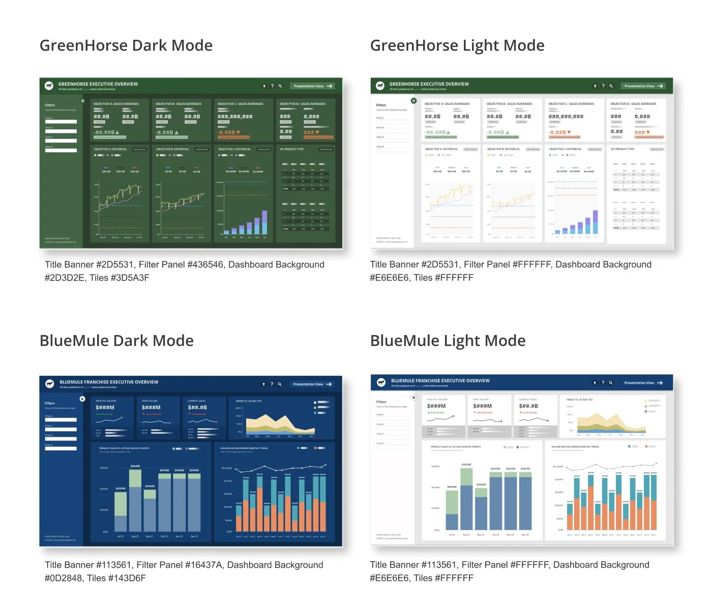
The second image below showcases all four new dashboards this style-guide will discuss, both GreenHorse and BlueMule have a light and dark mode dashboard using colors that are consistent with their current branding.
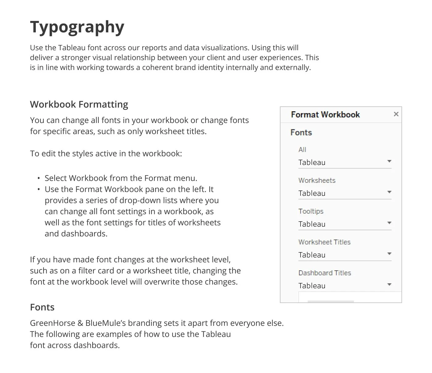
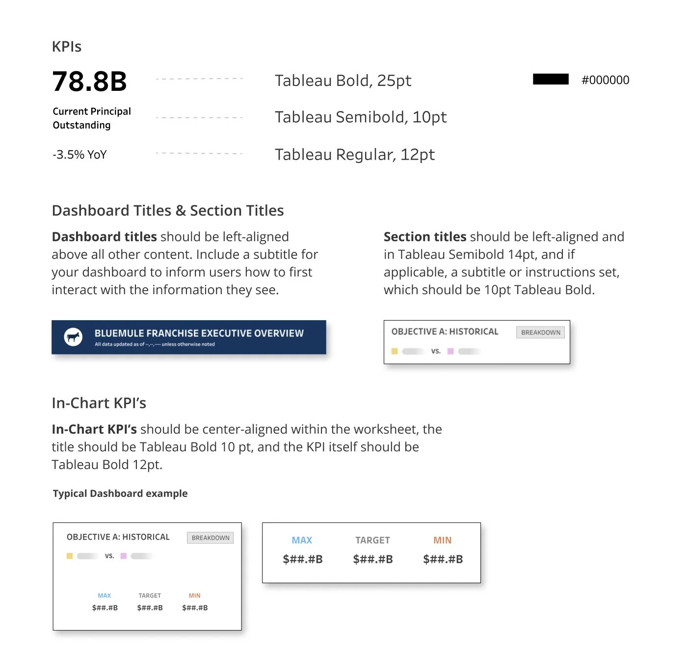
Typography
The page below lays out best practices for typography in terms of design principles, and how to carry those over into Tableau.
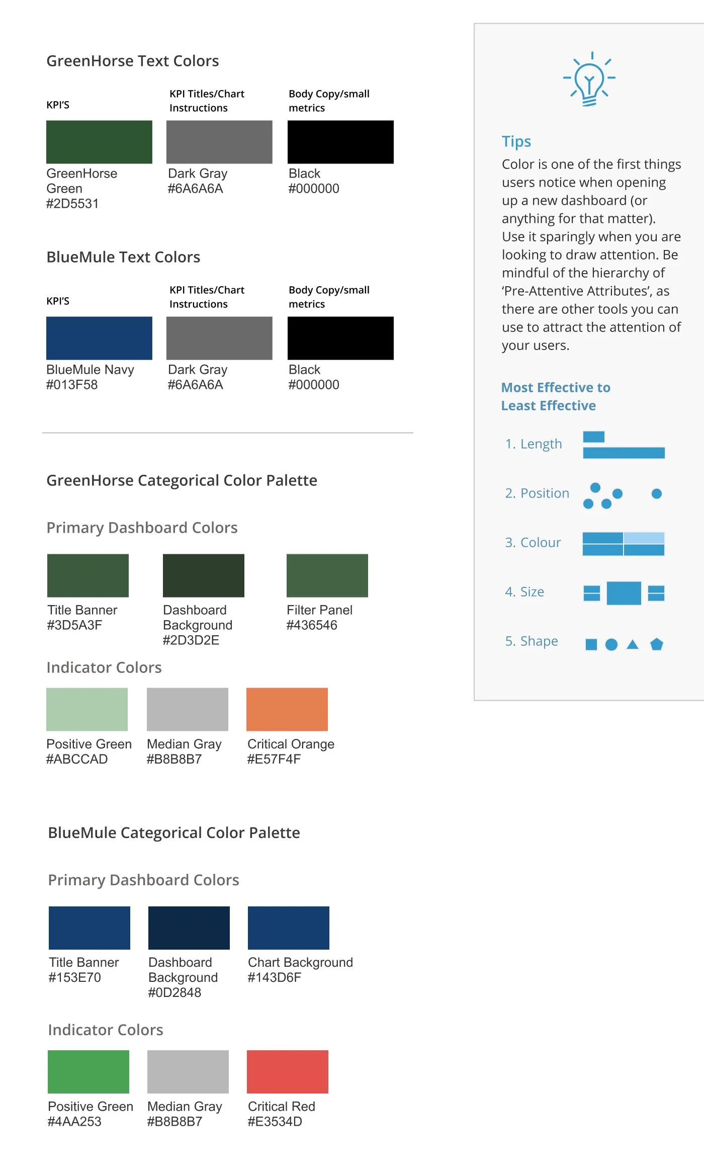
Color
The page below is a breakdown of color usage within the dashboard for the template, brand, visualizations, and indicator colors.
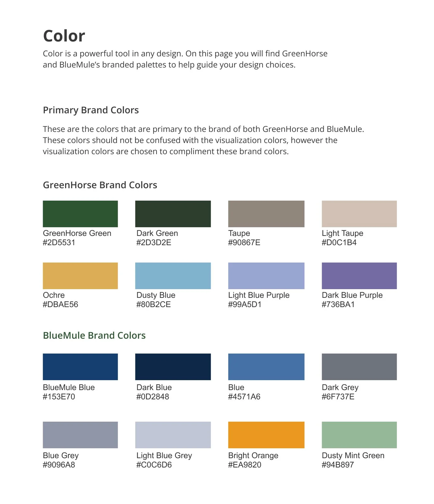
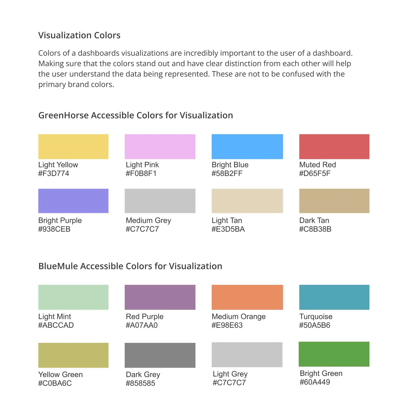
Throughout the entire project, I think it’s safe to say that color was the hardest part.
Color is a major visual guide for the user and when creating a style-guide there needs to be clear instructions on what the colors presented are representing, and do these colors invoke the meaning/feeling that you are trying to convey?
Another thing to note is making sure that all of these colors compliment the branding itself.
Iconography
The page below discusses the best practices of iconography use in a dashboard, as well as a breakdown of the icon library I created for products and programs that are personal to the GreenHorse and BlueMule brand.
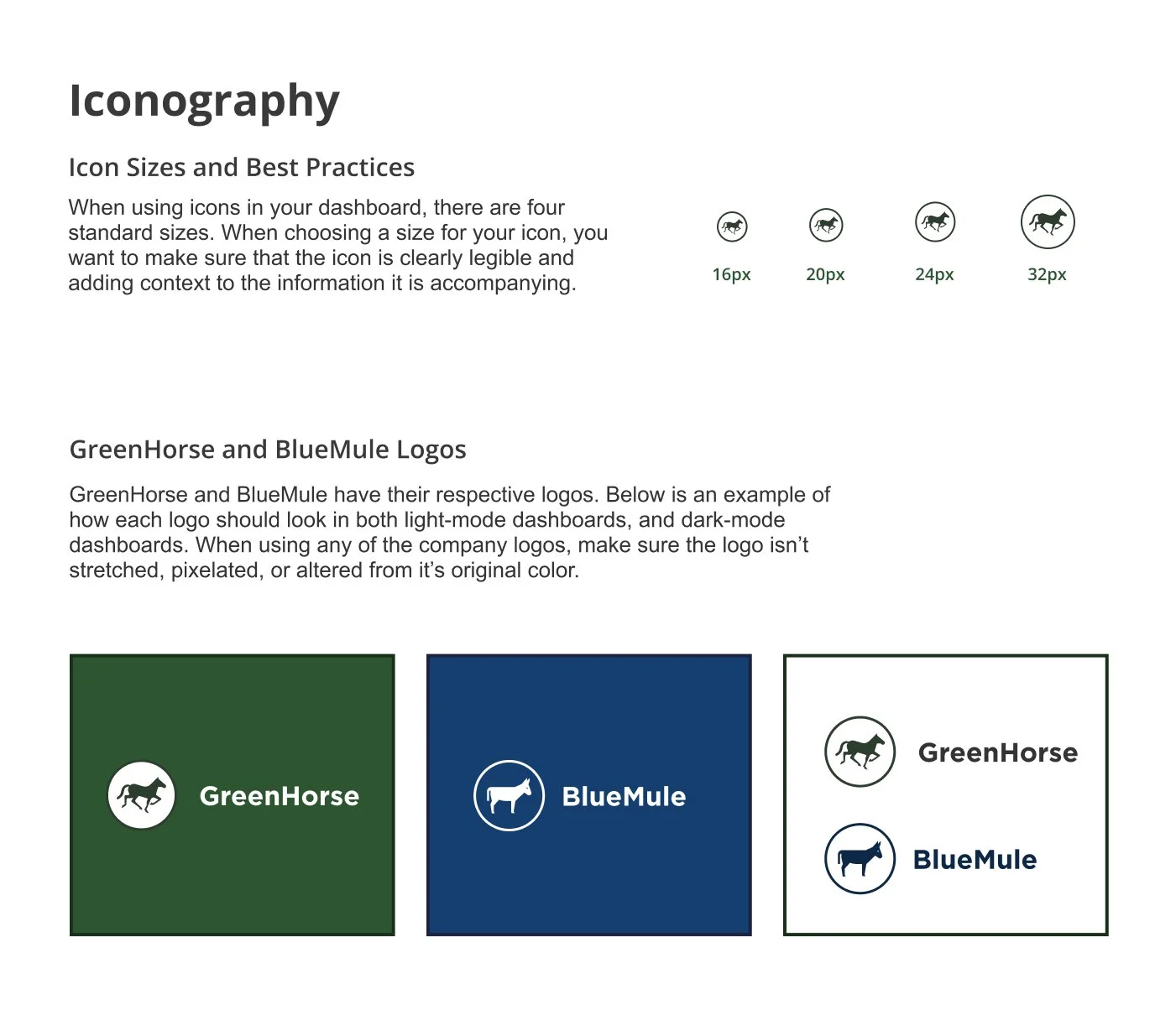
GreenHorse and BlueMules iconography is simple and concise, I wanted to make sure best practices are laid out on how to keep the logos from looking pixilated or distorted, but showing standard icon sizes in a dashboard, as well as what each logo looks like on their branded dashboard background.
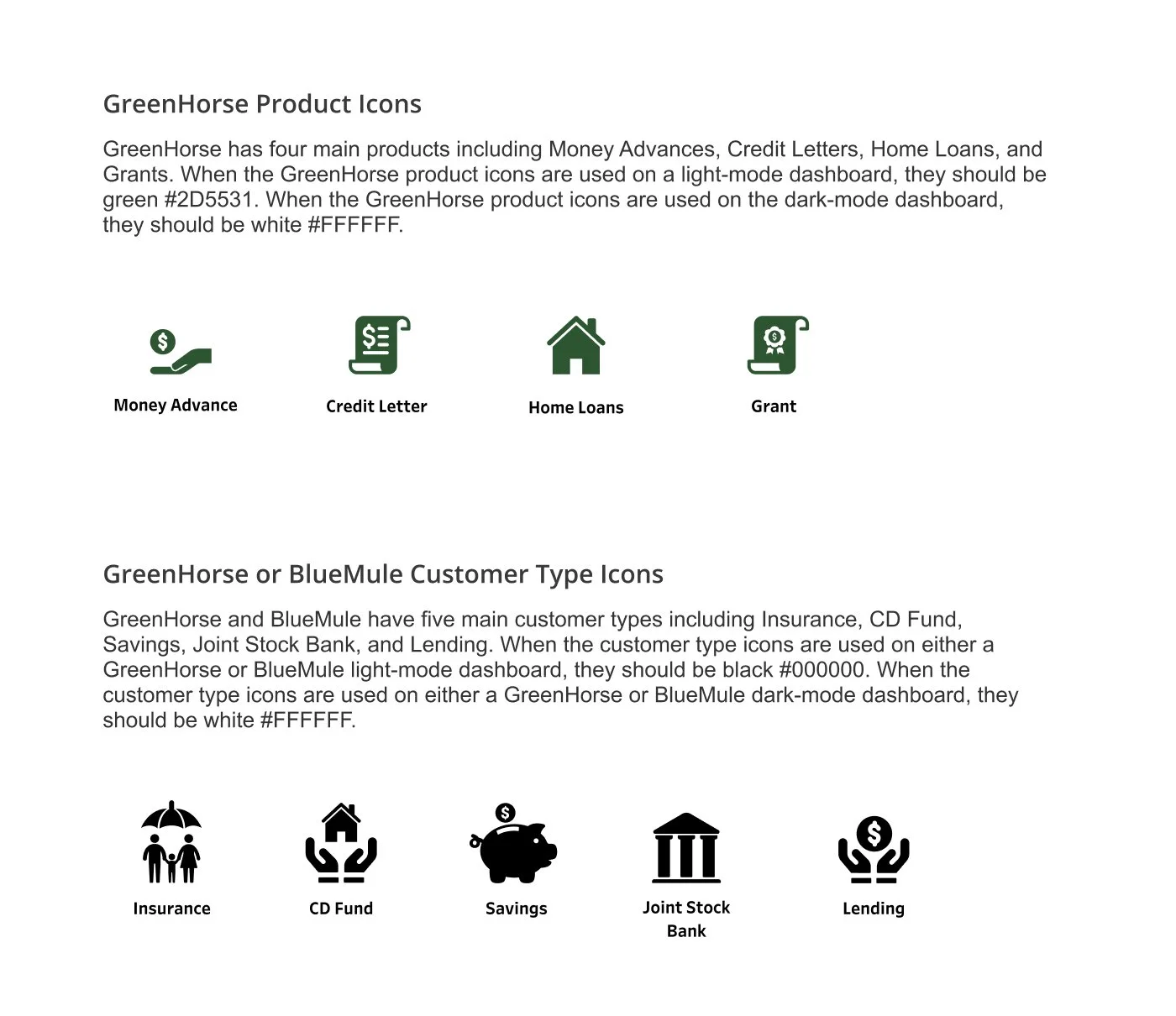
I created the product and customer icons based off a few icons they already had, but re-imagined. The original icons were very detailed and weren’t cohesive with each other, causing a loss in legibility for the user. To improve the icons, I kept the detail low (as much as the client would allow) while keeping line weight consistent for better readability.
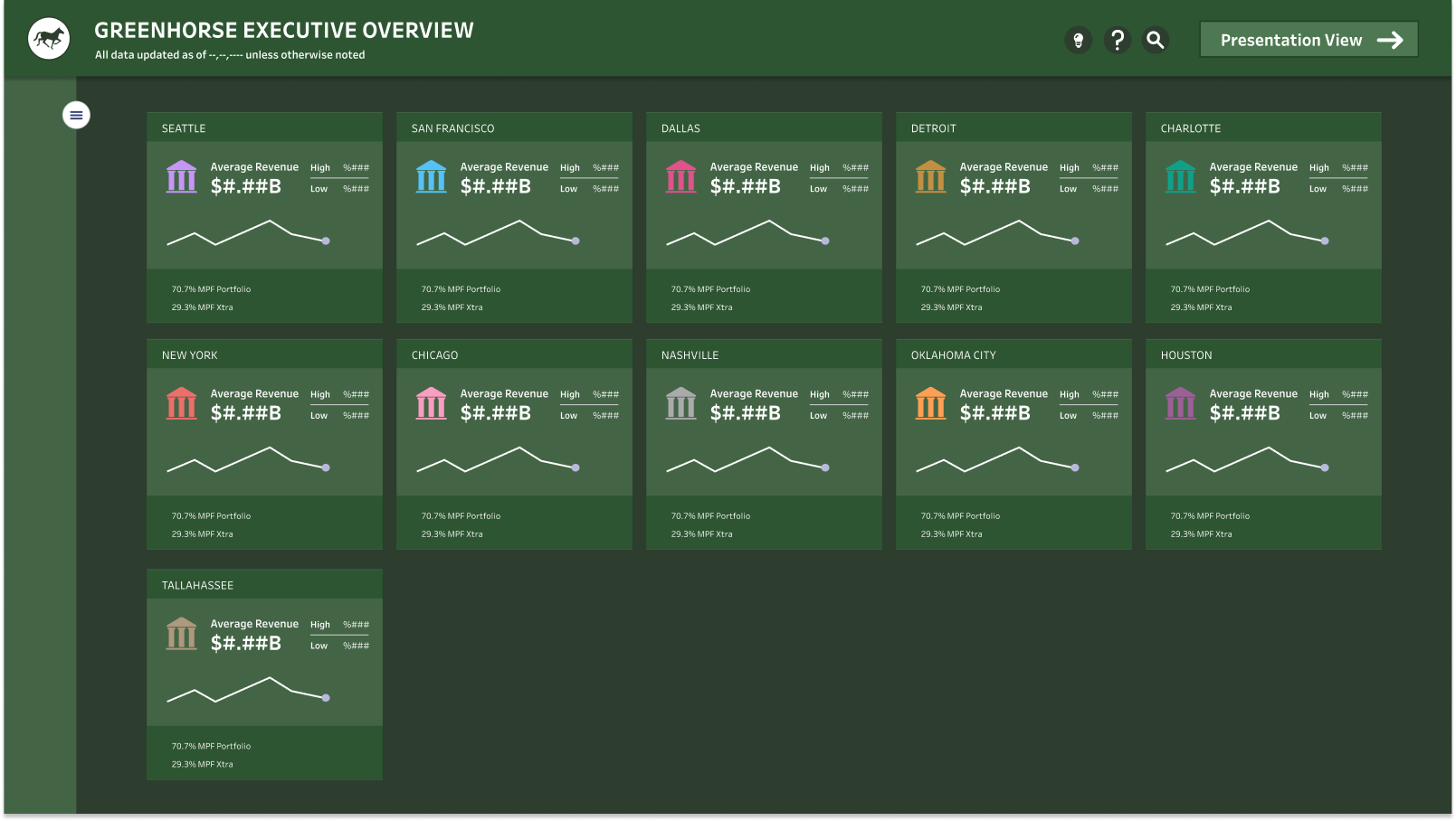
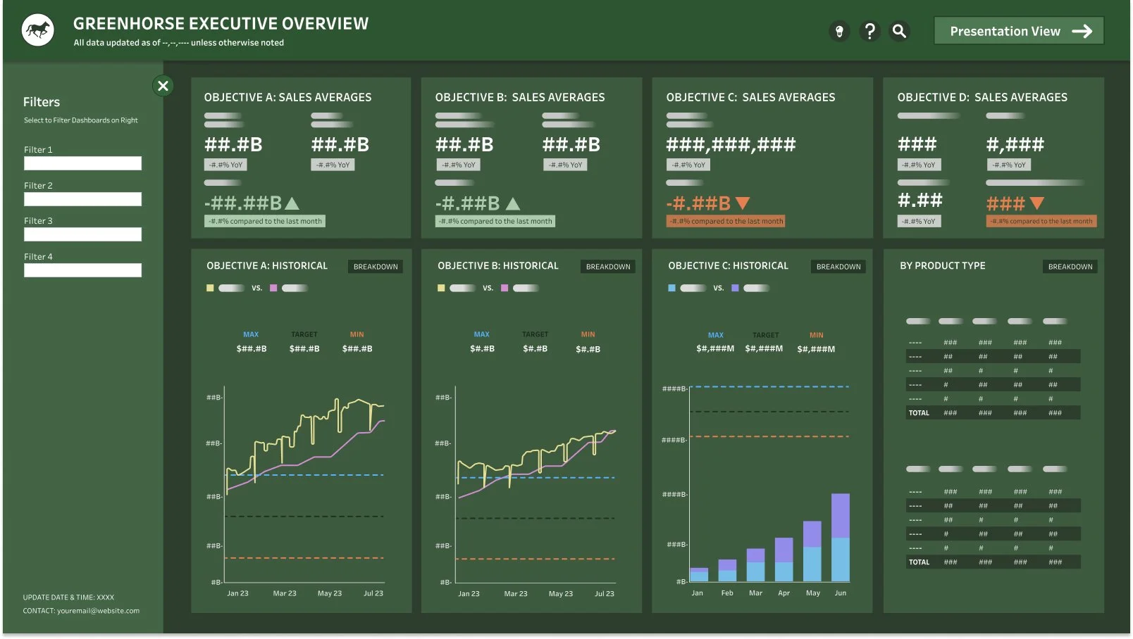
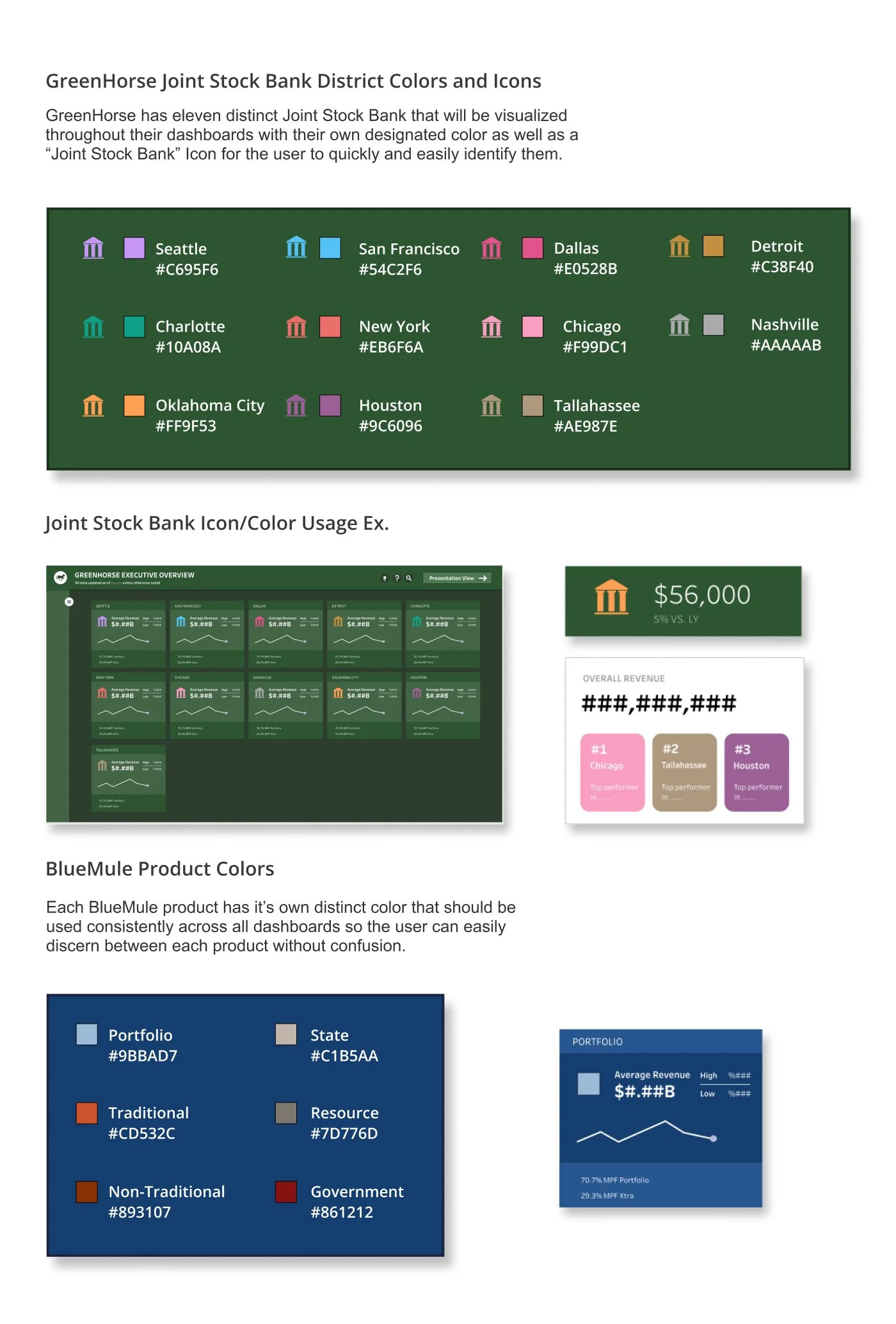
GreenHorse has eleven districts they need to keep a close eye on, so I created a joint stock bank icon with distinct colors for each district so they can be easily identified. the above dashboard is an example of how these can be used for an executive view of the districts.
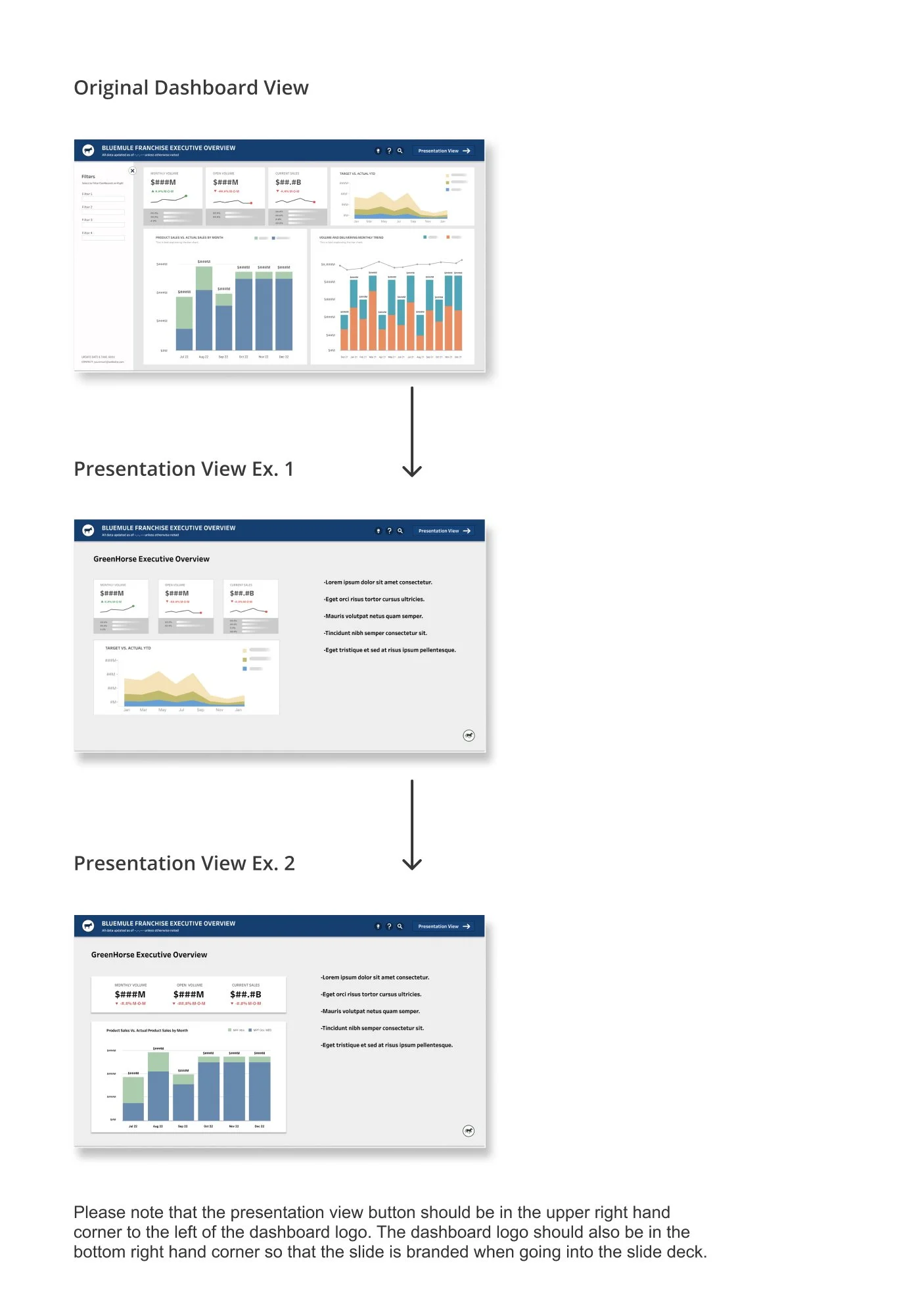
Presentation View
The page below is a walkthrough of how to create and use the new “presentation view” option on the daashboards to easily download a more palatable version of the dashboard for meetings and printables.
The client made it clear early on that they didn’t need their dashboards to be incredibly interactive because they need them for powerpoints/slide-decks, and printed formats. After some thought, it seemed clear to me that a presentation view should be available for the more highly used dashboards. The above pages are to clearly show how the developer would create a powerpoint view using the visualizations they already have, without pasting the entire dashboard onto a slide.